

A good shirt design usually looks simple when it’s done right. That’s the part that trips people up. If you’re figuring out how to make your own t shirt design, the goal is not to cram every idea into one graphic. It’s to create something clear, printable, and worth wearing more than once.
That matters whether you’re ordering one birthday shirt, building team apparel for a school club, or creating branded merch for a business. The best designs balance message, color, placement, and garment choice from the start. When you do that, the final print looks intentional instead of improvised.
How to make your own t shirt design without overcomplicating it
Start with the reason the shirt exists. A company giveaway shirt has a different job than a family reunion tee. A fundraiser needs to be easy to recognize from a distance. A staff shirt should reinforce your brand without looking too promotional. If you skip this part and jump straight into fonts and clip art, the design usually ends up busy.
Before you build anything, answer three questions. Who will wear it? Where will they wear it? What do you want people to notice first? That last question is especially useful because most strong shirt designs have one clear focal point, not four competing ones.
If you’re designing for a group, keep the audience practical. Students may want something trend-forward and less corporate. Employees may need a cleaner front print with a logo and department name. Event attendees often respond best to bold, readable graphics that show up well in photos.
Start with one strong concept
The fastest way to improve a shirt design is to narrow the idea before you ever touch the layout. Choose one primary message, one style direction, and one intended print location. That sounds basic, but it saves time and prevents the common problem of trying to make one shirt do too much.
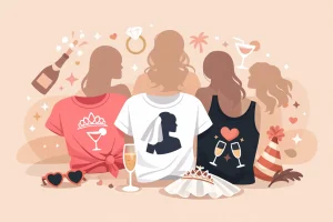
For example, a nonprofit event shirt might focus on the event name and date, with sponsors handled more subtly. A small business merch shirt might lead with a bold graphic on the back and a clean chest logo on the front. A bachelorette party shirt may work best with simple text and a playful color palette rather than a complex illustration.
This is where trade-offs matter. A detailed concept can look great on screen but lose impact on fabric. A minimalist concept may feel safer, but it often wears better and appeals to more people. If the shirt needs broad group approval, simpler usually wins.
Build the design around the shirt, not separate from it
A shirt is not a blank web page. Fabric color, garment size range, and print area all affect the final result. Designing on a white artboard without considering the actual shirt color is one of the easiest ways to get disappointed later.
Start by choosing the garment color early. That lets you see whether your text and graphics have enough contrast. Light gray text on a heather shirt may look modern on a monitor and nearly disappear in real life. Bright colors can be excellent for events and youth groups, but they can overpower subtle branding. Black, white, navy, and athletic heather are flexible because they make artwork easier to read and tend to satisfy a wide range of wearers.
Placement matters just as much. A full front print is the default for a reason – it gives you room and visibility. But not every design belongs there. Left chest prints work well for logos, staff shirts, and understated branding. Large back prints are popular for teams, organizations, and businesses that want stronger visual presence. If you add front and back printing, make sure the two sides support each other instead of repeating the same information.
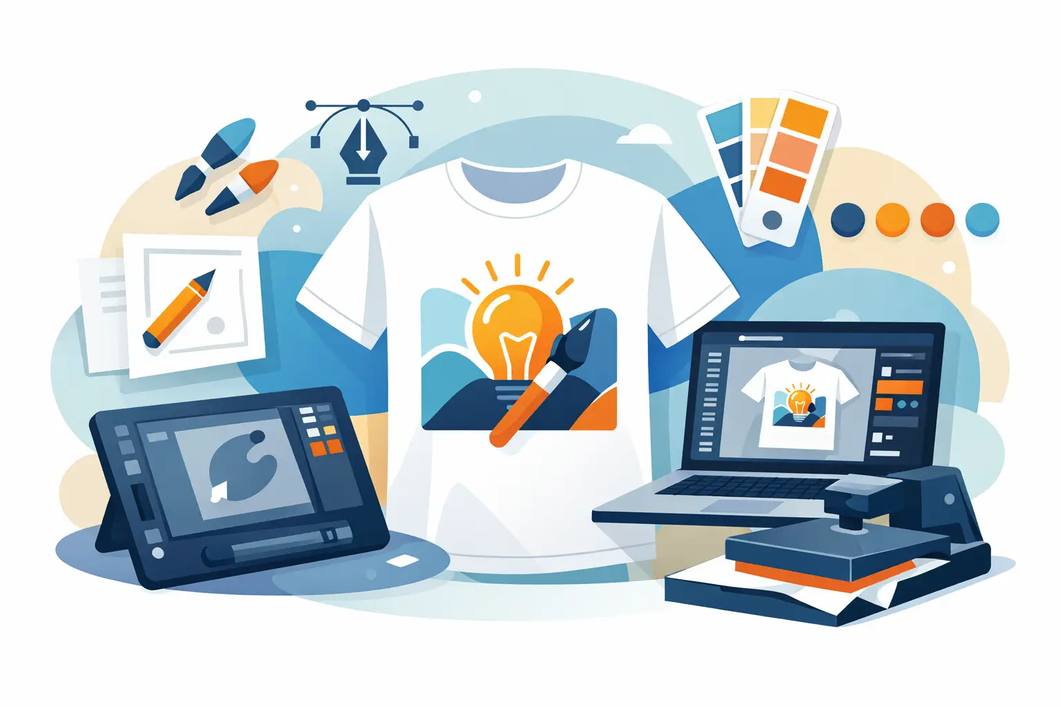
How to make your own t shirt design that prints cleanly
The best-looking shirt designs are usually the easiest to read. That means using fonts that hold up at print size, keeping enough space between elements, and avoiding tiny details that only work when zoomed in.
Use no more than two fonts in most cases. One can handle the main message, and the other can support secondary details. If both fonts are loud, the design starts fighting itself. Script fonts can look great for celebrations and lifestyle merch, but they’re risky for long phrases or group names. Sans serif fonts are often the safest choice for readability, especially for schools, teams, and business apparel.
Color selection should be intentional. Full-color digital printing gives you more flexibility, but more color does not automatically mean better design. Sometimes two or three well-chosen colors create a stronger result than a rainbow gradient. Think about contrast first, brand alignment second, and trends third.
Artwork quality also matters. If you’re uploading a logo or graphic, use the cleanest file you have. Blurry screenshots, small social media images, and low-resolution graphics often print exactly how they look – soft, pixelated, or rough around the edges. If your artwork is important to the project, it’s worth taking a minute to confirm the file is usable before you place an order.
Keep sizing and proportion realistic
One of the most common design mistakes is making the print too large. On screen, oversized graphics can feel exciting. On an actual shirt, they can look stiff, crowded, and less wearable. That’s especially true when the design spans too wide across the chest or sits too high near the collar.
A better approach is to scale for the average shirt size while understanding there will be some variation across the size run. Youth shirts, extended adult sizes, and women’s cuts can all affect how a print feels visually. If you’re ordering for a mixed group, choose a layout that remains balanced across multiple sizes instead of one that only looks right on a medium.
This is another area where it depends on the use case. Fashion-forward merch may intentionally use oversized back graphics. Event shirts may benefit from larger front prints for visibility. Staff apparel often looks more polished with moderate sizing and clean placement. The right choice is the one that matches how the shirt will actually be worn.
Match the design style to the order type
Not every custom shirt needs the same level of design work. If you’re ordering for a one-day event, speed and clarity may matter more than originality. If you’re creating branded merchandise to sell, your standards should be higher because people are choosing to wear it outside the event itself.
For schools and teams, bold typography, mascots, year markers, and clean icons tend to perform well. For nonprofits and fundraisers, a message-driven design with strong readability is usually more effective than something highly decorative. For company apparel, the question is whether you want the shirt to function as uniform, promotion, or merch. Each one points to a different design style.
That’s why a design lab can be useful for first-time buyers and repeat organizers alike. It gives you a faster way to test shirt colors, placements, and artwork without having to guess how the pieces fit together. If you already have a logo, you can build around it. If you don’t, you can still create something usable without starting from scratch.
Think about printing early, not after the design is finished
A shirt design is only successful if it prints well on the garment you choose. That sounds obvious, but a lot of people treat printing like the final step instead of part of the design process.
Digital printing is especially helpful when you want full color, photo-quality detail, or the flexibility to order small quantities without dealing with per-color pricing. That makes it a practical fit for short runs, one-off personalized items, and projects with lots of color variation. It also reduces some of the setup friction that can slow down traditional ordering.
Still, there are decisions to make. A soft retail-style tee may feel better for merch and casual wear, while a standard cotton shirt may be the more budget-conscious option for large events. Dark garments can make colors pop, but they also place more pressure on contrast and artwork clarity. The right print method and garment pairing should support your design, not force you to compromise it at the last minute.
Review it like a buyer, not the designer
Once your layout is ready, step back and check it the way an actual wearer would. Can someone understand the design in two seconds? Is the main message obvious? Does anything feel crowded, misaligned, or unnecessary?
This is the stage where small edits make a big difference. Remove one extra line of text. Increase contrast. Tighten the message. Resize the secondary element that keeps stealing attention from the main one. If you’re ordering for a business, school, or event committee, get one or two focused opinions instead of collecting feedback from everyone in the building.
If you want to move faster, use a platform that lets you preview the design on the actual product and make changes in real time. That cuts down on back-and-forth and helps you catch issues before production. Custom Tees Direct is built for exactly that kind of process, especially when you need full-color printing, flexible quantities, and a straightforward path from idea to order.
The best shirt designs are not always the most complicated ones. They’re the ones people actually want to wear, the ones that read clearly across the room, and the ones that still look good after the event is over. Start simple, make deliberate choices, and let the shirt do its job.