




A great custom shirt usually fails for one simple reason: too much happening at once. A small logo, three fonts, a slogan no one can read, and colors that looked better on a screen than they do on fabric. If you’re figuring out how to customize t shirt design, the goal is not to fit every idea onto a shirt. The goal is to make something people will actually want to wear.
That matters whether you are ordering one shirt for a birthday, outfitting a school club, or building branded apparel for a business. The best designs are clear, easy to recognize, and matched to the purpose of the order. Good customization is part design choice, part product choice, and part print strategy.
Start with the job the shirt needs to do
Before you choose colors or upload artwork, decide what the shirt is supposed to accomplish. A company staff shirt has a different job than a reunion tee. A fundraiser shirt needs to appeal to buyers, while a team practice shirt needs durability and fast reordering.
This is where many orders get off track. People begin with decoration instead of function. If the shirt is for employee visibility, the logo needs to be prominent and easy to read from a distance. If it is for an event giveaway, comfort and broad appeal matter more than intricate design details. If it is for a personal celebration, the design can be more playful, but it still needs to look intentional.
When the use case is clear, the design decisions get easier. You can narrow the message, choose the right garment, and avoid paying for features that do not actually help.
How to customize t shirt design without overdesigning it
The strongest shirt designs are usually built around one main idea. That might be a logo, a short phrase, a mascot, a date, or a piece of artwork. Once you know the focal point, every other element should support it instead of competing with it.
Keep the text short if the shirt needs to be read quickly. Front chest designs, left chest logos, and full front prints all work well, but each serves a different purpose. A left chest logo feels clean and professional for staff, company, or school use. A full front graphic gives more room for event shirts, clubs, and promotional apparel. Back prints are useful when names, schedules, sponsor logos, or team rosters need space, but they should not carry the entire design on their own unless that is intentional.
Font choice matters more than people expect. Script fonts can look great for weddings or boutique branding, but they often lose readability at smaller sizes. Bold sans serif fonts are easier for teams, school groups, and business uniforms. If you are mixing fonts, two is usually enough. More than that tends to make the design feel crowded.
The same goes for artwork. Clean graphics print better, read faster, and hold up better across different shirt sizes. If your design includes a photo or highly detailed illustration, make sure the file quality is high enough for printing. A blurry image will not improve once it hits the shirt.
Choose colors for fabric, not just for screen
A design that looks sharp on a white digital background can fall flat on a real shirt. Fabric color changes everything. Black shirts add contrast but can hide dark details. Athletic heather can soften bright colors. Bright shirts can compete with the artwork instead of framing it.
Start by thinking about contrast. Light ink on dark apparel is usually strong and easy to read. Dark ink on light apparel works the same way. Mid-tone on mid-tone can be stylish, but it is less forgiving. If the shirt is meant for visibility, skip subtle color combinations.
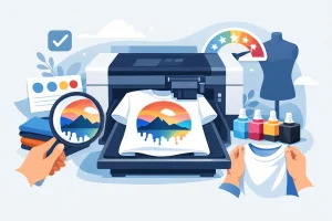
This is one reason digital printing is so useful for custom apparel. Full-color designs are easier to reproduce without forcing you to simplify every color decision. That gives you more flexibility for gradients, detailed logos, and artwork with multiple tones. It also helps when different departments, teams, or event groups need variations without changing the entire setup.
Still, more color does not always mean better design. A shirt with one strong print color can look more polished than a shirt trying to use every shade in the brand guide. If the message is the priority, use color to support readability first.
Match the shirt style to the audience
Design is not only what gets printed. The shirt itself is part of the final result. A youth fundraiser, a company outing, and a premium retail-style merch drop should not all start with the same blank garment.
For broad groups, classic short sleeve tees are the safest option because they fit the widest range of budgets and preferences. For workplace apparel, polos or better-quality tees may feel more appropriate depending on the environment. For colder seasons or staff gifts, hoodies and sweatshirts often get more repeat wear than basic event tees. Tank tops can work well for fitness events or warm-weather promotions, but they are more audience-specific.
Fit and fabric matter too. A soft cotton or cotton blend often gets better reactions than a stiff, heavy shirt, especially when the order is meant to be worn more than once. If the shirt is part of a business brand, comfort helps because employees are more likely to wear it voluntarily. If you are ordering for a one-day event, budget may lead the decision more than premium feel. That trade-off is normal.
Placement can make or break the design
One of the easiest ways to improve a custom shirt is to get the print placement right. Even strong artwork can look off if it is too high, too low, or scaled poorly for the garment.
A full front design works best when the graphic is balanced with the shirt size. Too small and it feels accidental. Too large and it can overwhelm the garment, especially on smaller sizes. Left chest placement is popular because it is clean and versatile, but detailed logos often need simplification at that size.
Back designs are useful when you need extra information, especially for schools, teams, events, or organizations with sponsors. Just remember that the front still matters. If the front is blank and the back carries all the value, the shirt may feel less wearable outside the event itself.
Sleeve prints and tag-area prints can add a polished touch, but they make the design more specialized. They are worth considering for branded merchandise or premium organization apparel, not always for quick event orders.
Use the right level of customization for the order size
Not every order needs a fully built brand concept. Sometimes the fastest path is the right one. If you need shirts for a volunteer group next week, a clean logo on a reliable garment may be smarter than spending days refining secondary graphics.
On the other hand, if you are creating apparel for a storefront, a company rollout, or a school program that will reorder throughout the year, it pays to think more strategically. Standardizing logo placement, shirt colors, and artwork files will save time later and create a more consistent look.
This is where an online design tool can help. You can test layouts, compare product options, and see how artwork behaves on different garments before committing. For customers with no design background, that kind of visual preview removes guesswork. For experienced buyers, it speeds up decision-making.
How to customize t shirt design for different groups
Business apparel usually works best when it is clean, brand-forward, and easy to wear in real settings. Keep the logo visible, avoid novelty graphics unless the event calls for it, and choose garment colors that support the brand without making employees feel like walking billboards.
Schools and teams often need more identity and energy. Mascots, class years, team names, and event graphics can all work well, but the design still needs hierarchy. The main name or graphic should stand out first. Supporting details should stay secondary.
For nonprofits and fundraisers, wearability matters because the shirt often supports awareness beyond the initial event. People are more likely to wear a shirt regularly if the design feels current and not overly promotional. A good cause on a good-looking shirt performs better than a worthy message on a shirt no one wants to keep.
Personal celebrations give you more room to have fun, but readability still wins. Birthday trip shirts, reunion tees, and bachelorette apparel often lean into inside jokes or themed graphics. That can work well as long as the design is still visually organized.
Final checks before you place the order
Before approving the design, zoom out and ask a few practical questions. Can someone understand it in three seconds? Does the shirt color help or hurt the artwork? Will people actually wear this again? Is the garment choice right for the audience and budget?
Also check names, dates, and spelling twice. Most shirt mistakes are not creative mistakes. They are simple production errors caused by rushing through the final proof.
If you are unsure, simplify. Clear beats complicated almost every time. The best custom shirt is not the one with the most design elements. It is the one that feels right the moment someone puts it on.
Custom Tees Direct makes that process easier by combining no-minimum flexibility, full-color digital printing, and a Design Lab that helps you build fast without needing design experience. Whether you are ordering one shirt or rolling out apparel for a full organization, the smartest designs start with clarity and end with something people want to wear again.